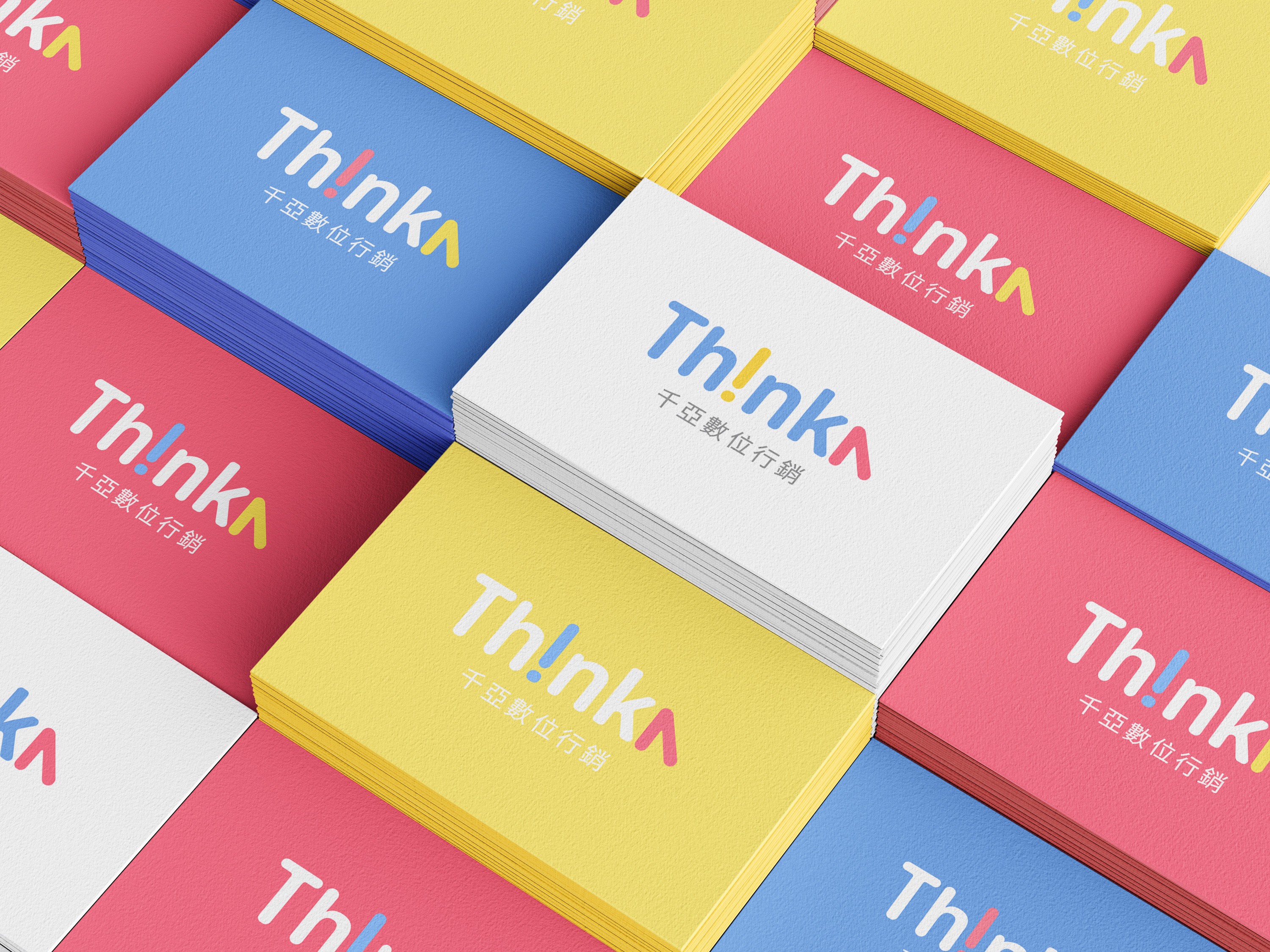
Thinka Digital Marketing Brand Identity Design
Thinka is a digital marketing company focused on advertising placements and strategic consulting, providing integrated marketing services including digital advertising, corporate training, mobile app optimization, video production, virtual and real-world integration operations, and word-of-mouth public relations operations, providing clients with comprehensive solutions. Through a new brand design, it presents Thinka's professionalism, diversity, and creative capabilities in the digital field.


By conveying the concept of digital and creativity with simple symbols, turning the letter 'i' upside down to an exclamation mark symbolizes the surprise and creativity brought by Thinka in marketing, and visually achieves a sense of pause, increasing the eye-catching effect. And by simplifying the uppercase 'A' to a mouse cursor or arrow, it emphasizes the visual connection between the brand and digital.


Fill arrow A with a solid triangle as an extended graphic to add dynamism and fun to the brand while reinforcing the consistency and memorable points of the brand tone, and allowing for more diverse extension applications.

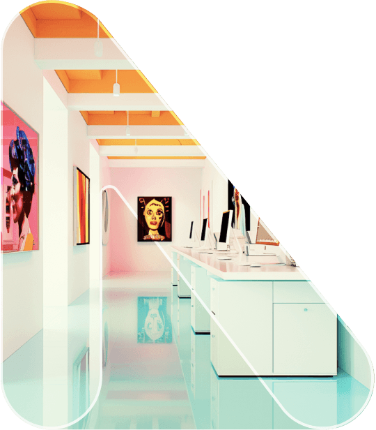

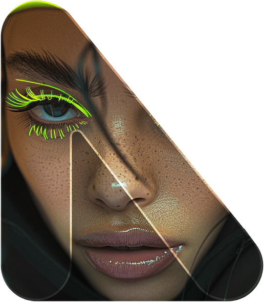
Background Image
Using repeated symbols and brand colors as the background graphics, through the arrangement of repeated symbols, the application is more diverse and flexible, and can be used in various digital and printing scenarios.